

PermalinkCSS Grid Layout
The CSS grid layout module excels at dividing a page into major regions or defining the relationship in terms of size, position, and layer, between parts of a control built from HTML primitives.
Like tables, grid layout enables an author to align elements into columns and rows. However, many more layouts are either possible or easier with CSS grid than they were with tables. For example, a grid container's child elements could position themselves so they actually overlap and layer, similar to CSS positioned elements.
PermalinkProperties for Parent Elements
Permalinkdisplay
This property is used to arrange the items in container in inline or block depending on the value and element. It helps in taking the only space where the content is then using other properties we can set the direction and other properties. This property is set to grid while using CSS grid layout model without this other properties of the grid won't be working.
.container {
    display: grid;
    /* grid properties */
}
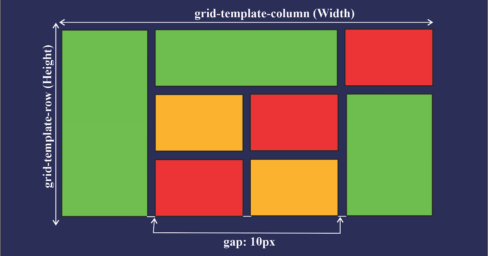
Permalinkgrid-template-columns and grid-template-rows
These properties are used to declare the number of grid we want by providing the grid layout width and height by using both column and row templates
grid-template-columns By using this property we can set the width of the each column if we mention the 100px then the column width will be 100px we can use other units as well.
grid-template-columns By using this property we can set the height of the each column. grid height can be set using this property.
Permalinkgrid-template-areas
This property is used to set the column and row distribution of the particular column by setting names to the items. After we applying the columns and rows by using the grid-template-area property we will set the area distribution of the rows and columns by setting the names as per the requirement after setting names we simply assign the names to the children items by targeting them and assigning. see the below codepen to see the code and how it is actually working. grid-area is the property which is used to assign the names to children items. more about grid-area is explained in the Properties for the children Elements section of the article.
Permalinkgap properties
Permalinkcolumn-gap
This property is used to give the column gap between the grids. It is really easy to understand these properties by using this property we can apply the gap outside the grid.
Permalinkrow-gap
This property is used to give the row gap between the grids. By using this property we can apply the gap outside the grid.
Permalinkgap
This is the shortcut property for assigning the column and row gaps. By using this we can give the both values to the gap property. checkout the below codepen to see these properties in action.
Permalinkjustify-content and align-content
justify-content is used to align the grids in horizontal direction based on the property values. grids will be arranged in the horizontal.
align-content is used to align the grids in vertical direction based on the property values. grids will be arranged in vertical direction. checkout below codepen to understand all of the property values available in these properties.
Permalinkjustify-items and align-items
justify-items is used to align the content inside the grid in the horizontal direction. Remember this property is different from justify-content.
align-items is used to align the content inside the grid in the vertical direction. Remember this property is different from align-content.
PermalinkImportant Units and Functions
Permalinkfr units
This is the fractional unit which takes the portion of the available space means when we mention 1fr it means it will take 1 portion of the available space it depends on the total fractions if there is only 1 fraction than total available space (100%) is taken if there are 4 fractions than each fraction takes 25% of available space.
.container{
    display: grid;
    grid-template-columns: 1fr 1fr 1fr;
    grid-template-rows: 1fr 1fr 1fr;
}
Permalinkrepeat() and minmax()
repeat() this function is used when we want same to apply same size for multiple rows or columns in the parenthesis we can pass two values first one is the number of repeated rows or columns sizes we want and the second one is the size we can use fr , px or % as the units.
.container{
    display: grid;
    grid-template-columns: 1fr 1fr 1fr;
    grid-template-rows: 1fr 1fr 1fr;
}
/* above code output will be same as the below code */
.container{
    display: grid;
    grid-template-columns: repeat(3,1fr);
    grid-template-rows: repeat(3,1fr);
}
Thanks for reading...