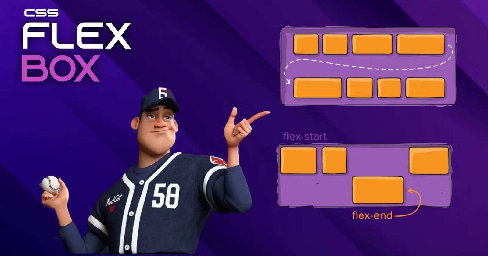


What is Flexbox?
Flexbox is a CSS layout module that allows you to create flexible and responsive layouts. It's designed to simplify the process of designing web layouts by providing a flexible, easy-to-use layout system. Flexbox allows you to align and distribute items in a container, making it an excellent choice for creating responsive layouts.
Properties for Parent Elements Flexbox
Display
To enable Flexbox, you must set the display property of the container to either "flex" or "inline-flex". This property serves the purpose of defining the container as a flex container.
.container{
    display: flex;
}
flex-direction
The "flex-direction" property determines the orientation of the main axis in a flex container. By default, it is set to "row", but it can also be set to "row-reverse", "column", or "column-reverse".
iner{
    display: flex;
    flex-direction: row | row-reverse | column | column-reverse;
}
flex-wrap
This property is used to set the wrap behaviour without this property items will shrink or expand if size is not compatible to avoid this flex-wrap is used with values as wrap no-wrap wrap-reverse these will determine the wrap behaviour.
flex-wrap: no-wrap; The 'now-rap' value is the default setting for the 'flex-wrap' property. When set to 'now-rap', all flex items will be displayed on a single line, without wrapping to the next line.
flex-flow
This property is a shortcut property for the flex-direction and flex-wrap where the first value will be the flex direction and second will be for wrap.
.container {
  flex-flow: row wrap-reverse;
}
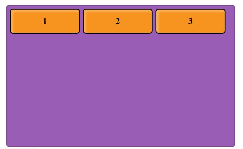
Justify-content
This property is used to align the content in horizontal direction as needed. As the values provided to the property the alignment will be done.
Align-items
This property is used to align the content in vertical direction as needed. As the values provided to the property the alignment will be done. These two properties are most useful. let's see both properties in action below.
all the values are human understandable we need to play around with code to understand actual working of the values. I have provided all the property values in the code.
Align-content
This property works same as the align-items but the difference is this is used to align the total content in the parent element. All the values are given below.
.container{
    align-content: center;
    align-content: flex-start;
    align-content: flex-end;
    align-content: space-around;
    align-content: space-between;
    align-content: stretch;
}
Gap
This property is used to give gap between all the items in the parent element. we can give row-gap and column-gap manually or can apply gap to all sided using gap property.
.container {
  gap: 10px;
  gap: 10px 20px;
  row-gap: 10px;
  column-gap: 20px;
}
we can also use shortcut for row and column by using both gaps in same line as given in above code.
Properties for Child Elements
Order
This property is used to set the order of the items by default every items order is set to 0 when we add order to some particular item then the arrangement will be layed according to that for example if we use order as 1 then that item will be arranged after all the 0 ordered items and if we use -1 order will be before the 0 ordered item. We can use the negative and positive numbers in the order property.
.item {
  order: 1;     /* default will be 0 for every item*/
}
flex-grow
This is used to give the ability to grow to item. we can assume as the parts in the available area. If all the items is set to 1 then the area will be distributed equally in the items.
.item1 {
    flex-grow: 1;
}
.item2 {
    flex-grow: 1;
}
.item3 {
    flex-grow: 1;
}
.item4 {
    flex-grow: 1;
}
flex-shrink
This property is used to set the ability to shrink when there is no enough space is available this is exactly opposite to the flex-grow property used to give the shrink values.
.item {
  flex-shrink: 2;
}
align-self
This property is used to override the align-items property for the single element and we can apply the required values to that particular selected items.
.item1 {
align-self: flex-start;
}
Thank you...