
Media Queries
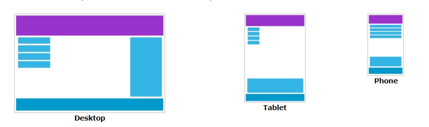
The CSS Media Query gives you a way to apply CSS only when the browser and device environment matches a rule that you specify, for example "viewport is wider than 480 pixels". Media queries are a key part of responsive web design, as they allow you to create different layouts depending on the size of the viewport, but they can also be used to detect other things about the environment your site is running on, for example whether the user is using a touchscreen rather than a mouse. In this lesson you will first learn about the syntax used in media queries, and then move on to use them in a working example showing how a simple design might be made responsive.
The simplest media query syntax looks like this:
@media media-type and (media-feature-rule) {
  /* CSS rules go here */
}
Media Types
There are a number of media types that can be targeted using CSS Media Queries. The most common media types include:
all: Applies to all devices and media types.
@media all  {
    .container{
        /* styles */
    }
}
screen: Applies to screens (desktops, laptops, tablets, and smartphones).
@media screen  {
    .container{
        /* styles */
    }
}
print: Applies to printers and print preview mode.
@media print  {
    .container{
        /* styles */
    }
}
speech: Applies to screen readers and other speech synthesizers.
Device Breakpoints
These are used to mention the device minimum and maximum width on which you want to apply the CSS styling.
Expressions
Media queries can also include one or more expressions that define the characteristics of the device or browser being targeted. These expressions can include:
width: The width of the viewport.height: The height of the viewport.orientation: The orientation of the device (portrait or landscape).aspect-ratio: The aspect ratio of the viewport.min-width: The minimum width of the viewport.max-width: The maximum width of the viewport.min-height: The minimum height of the viewport.max-height: The maximum height of the viewport.resolution: The pixel density of the device.
min-width: 600px;
This property is used to give the minimum width from where the given styling should start applying. Only from this width the given styling will be applied.
@media (min-width: 768px) {
    .container{
    /* styles */
    }
}
max-width: 900px;
This property is used to give the maximum width up to where the given styling should be applied. After crossing the range then the all of the styling mentioned in this query will be removed.
@media (max-width: 1180px) {
    .container{
    /* styles */
    }
}
We can use both the properties using the conditional operators to target the particular size. example is provided below.
@media (min-width: 768px) and (max-width: 768px)  {
    .container{
    /* styles */
    }
}
Apart from these we can also use height , width using conditional operators but it is not recommended.
Conclusion
CSS Media Queries are an essential tool for creating responsive web designs. By using media queries, developers can adapt the layout and styling of a webpage based on the user's device or screen size. In this article, we covered the basics of CSS Media Queries, including media types, expressions, and example usage. By mastering media queries, you can create web pages that are optimized for a wide range of devices and screen sizes...